Graph all the things
analyzing all the things you forgot to wonder about
Map Projections 4: Bullying the Ocean
2024-03-18
interests: maps
In parts 1, 2, and 3, I explained why and how I'm training optimal map projections and showed some initial results.
Like clockwork, every time I mention this project to someone, they blurt out, "F*** the oceans." Maybe not in those exact words, but it's clear people value the continents over the oceans and would like to see a map teaching the oceans their place.
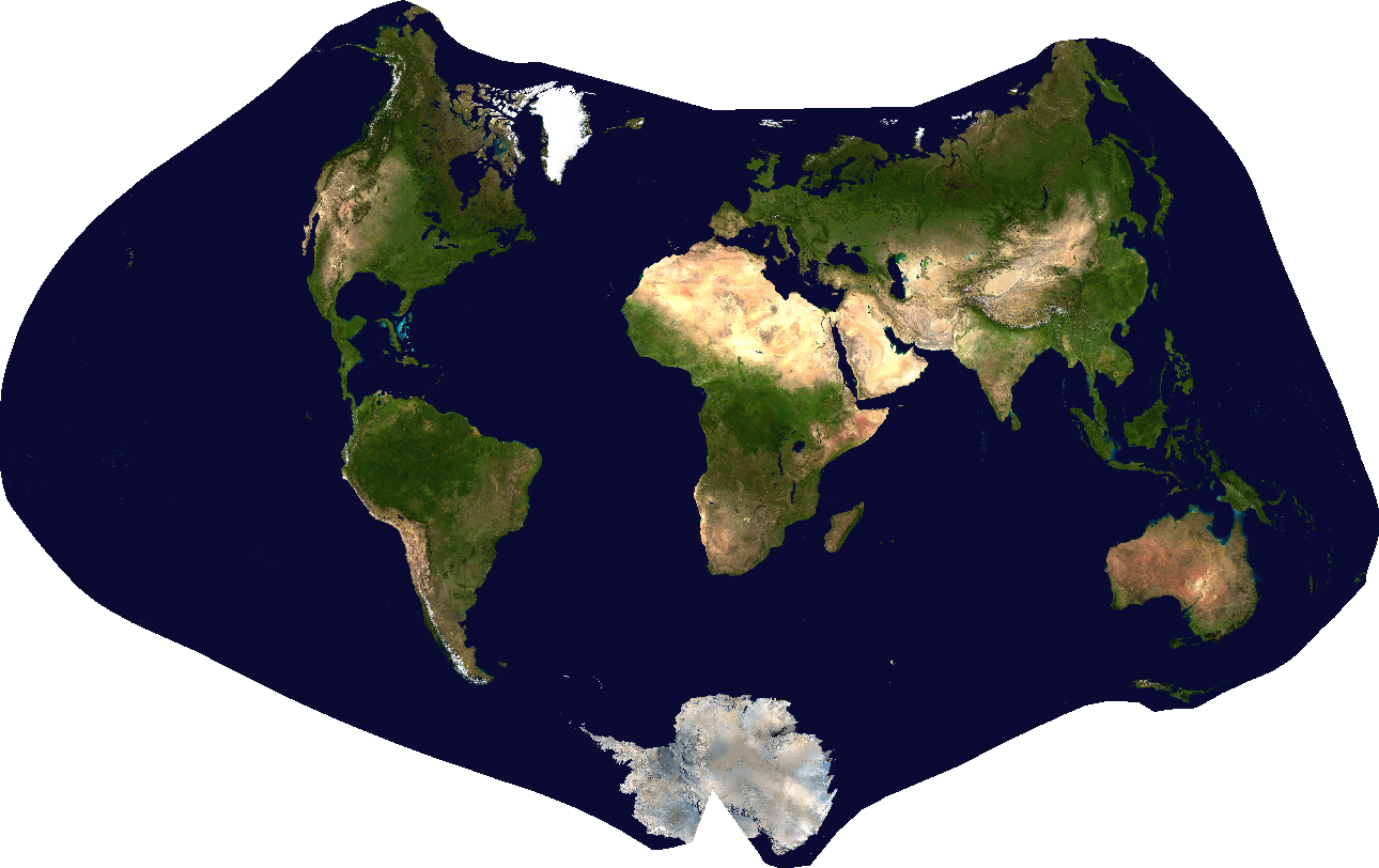
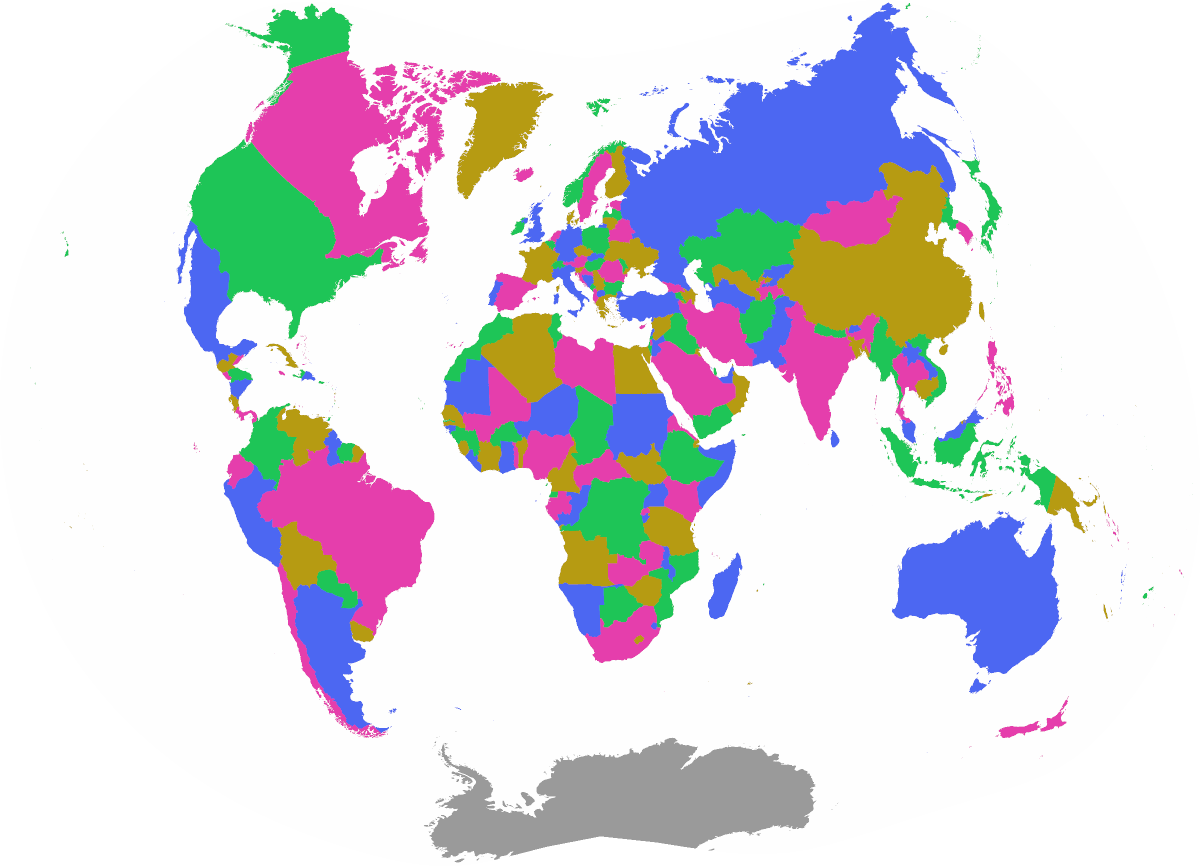
So I made one. Let's call it Martin 2:
Method
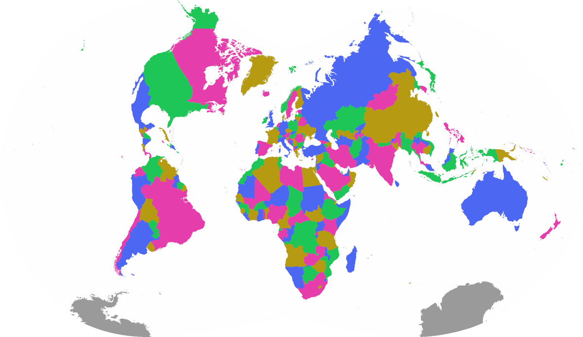
I started by making a shoddy filter of the oceans based on pixel value. Good enough:

For each triangle in the lattice, I calculated the proportion that was water. I downweighted the angular loss in these regions to 1% of what it was on land, so the projection still cares about the shape of the ocean a little bit, but not enough to sacrifice meaningful accuracy on land. I left the areal loss the same everywhere, because I still care about the overall size of the oceans.
World Tour
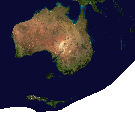
One implication of the distorted ocean is that we've lost some sense of the relative locations of landmasses. Just look at New Zealand and Australia, lol:
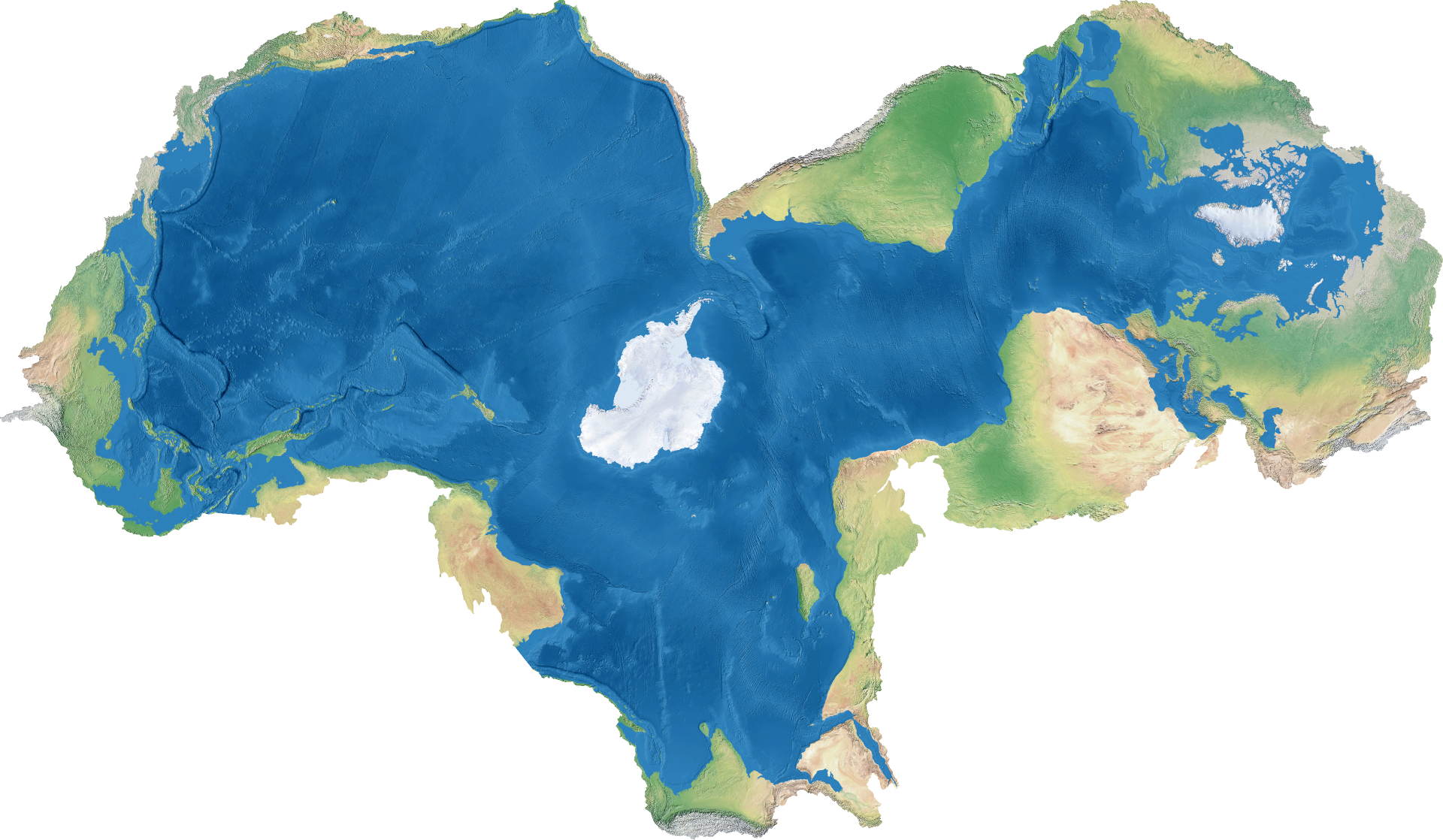
It's also interesting to look at the lattice lines overlayed:
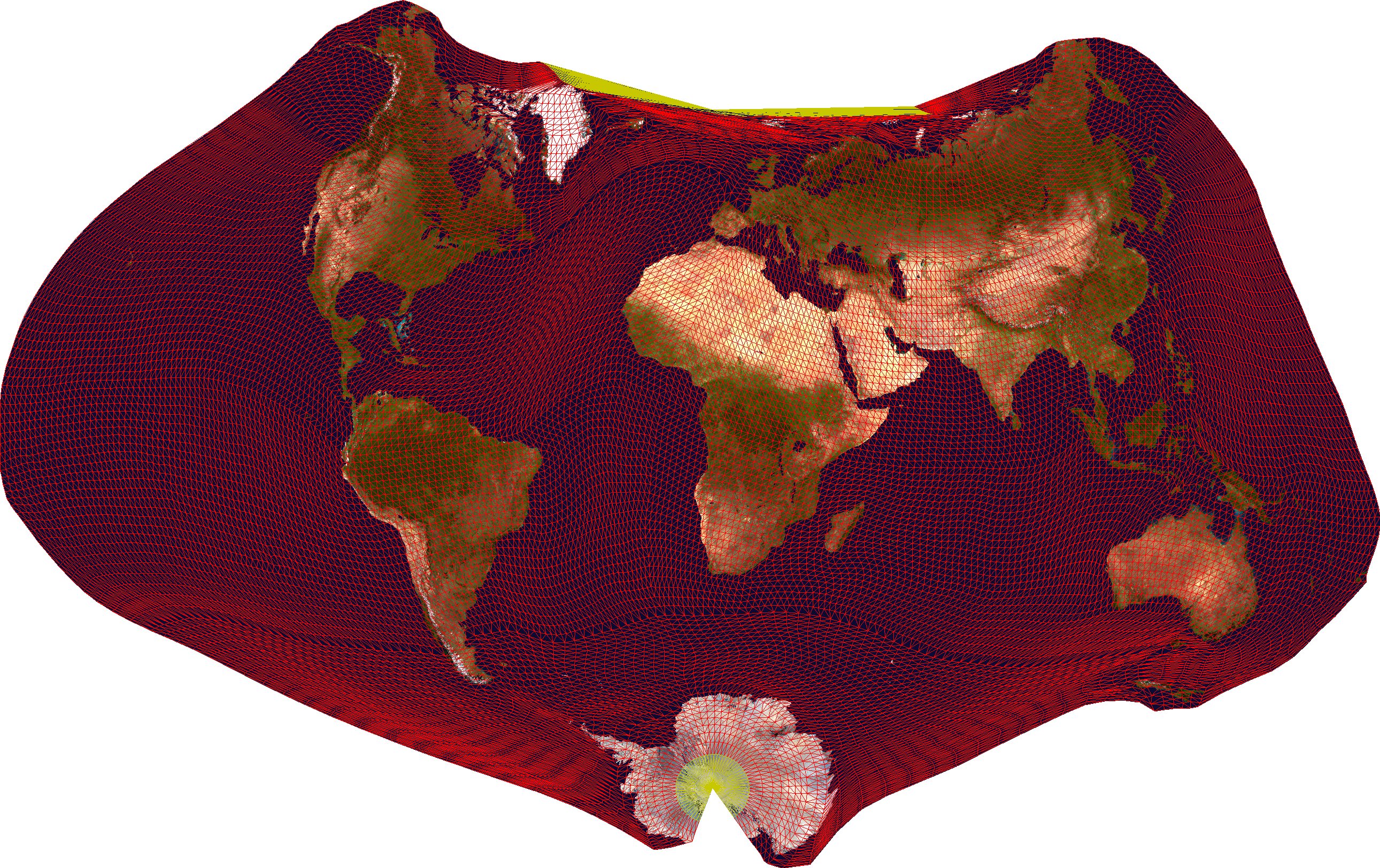
There's such a big squiggle across the Atlantic ocean between North America and Europe! It's trying to undo the curvature it needs to apply in both these continents. And you can see just how much it's warping the Southern Ocean to allow Antarctica to look okay.
Here are the plots of the areal and angular distortions:
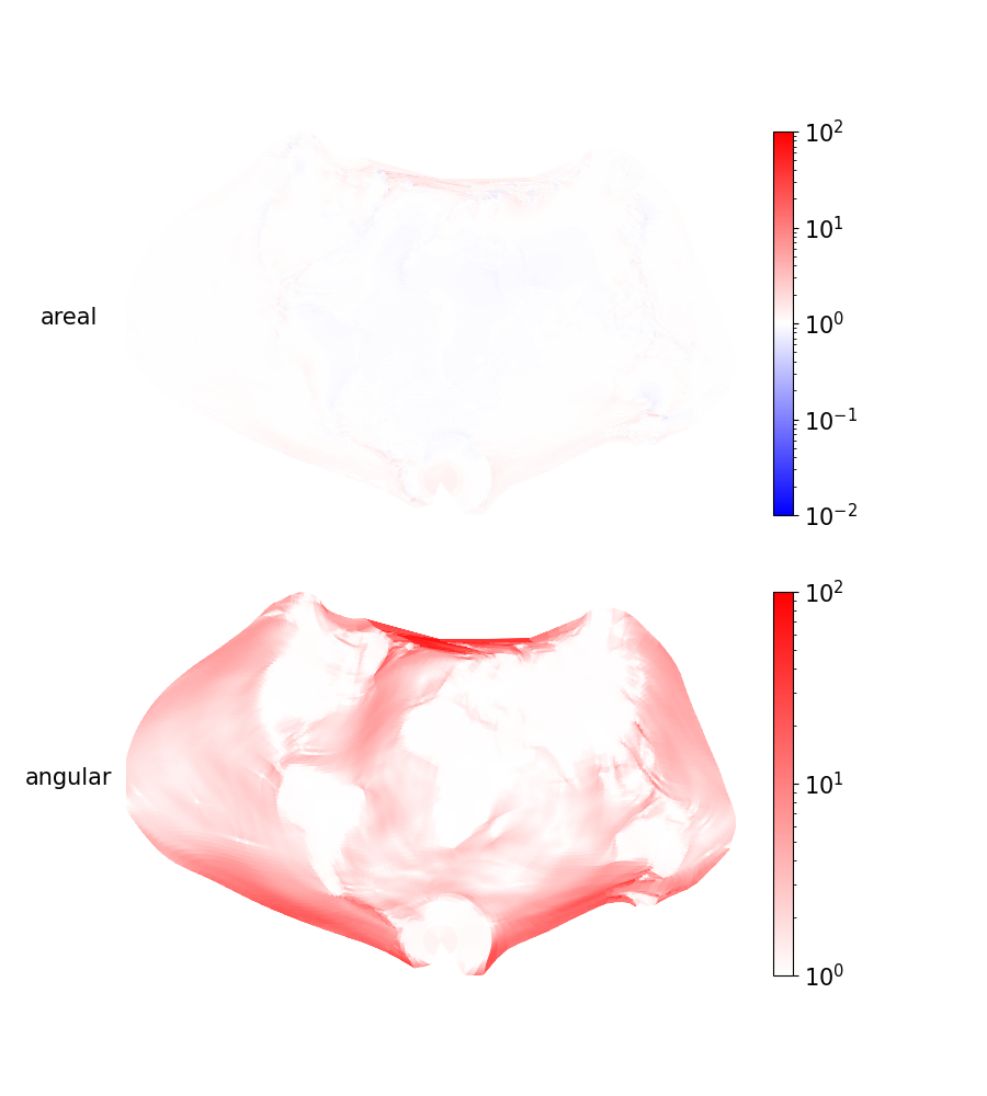
The continents are very nearly equal-area and conformal, so if land is all you ever cared about, look no further. The only perceivable areal distortions are at the coasts and North Pole. But of course, there are huge angular distortions in the oceans, especially near the poles. Making Antarctica look round isn't easy!
Comparisons
I mentioned his work in an earlier post, but Justine Kunimune has also trained/optimized map projections, some of which play with land vs. oceans. Below are some of his works.
Danseiji III, which is most similar to what I've done, except it also interrupts Antarctica in half:
Danseiji V, which also screws up the areas of the oceans. I hate this one:
Elastic II, which does the oppose and depicts the oceans more accurately than land:
I think (except for Danseiji V) these are really cool, and it's clear that a lot of creativity and clever thinking went into them.
If forced to appraise my own work, I think its novelty is still in the loss function. I believe it captures our true goal better than anything else, and that leads to better-looking map projections.
In the next part, I'll look into adding interruptions.