Graph all the things
analyzing all the things you forgot to wonder about
Map Projections 3: The Essential Results
2024-03-06
interests: maps
In part 1 and part 2, I explained why and how I'm training optimal map projections to minimize area and angular distortions. After a quick update, let's look at the essential results!
Quick Update
Since last time, I tweaked a few things.
First, I gave the lattice more symmetries (not just  but also
North/South and East/West now):
but also
North/South and East/West now):
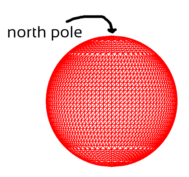
I also upgraded the lattice size from 3,044 points and 6,000 triangles to 18,107 points and 36,000 triangles.
Next, I started using LBFGS optimizer for most projections, which spared me from tuning learning rates. It was also a hair faster than Adam in most cases:

Though for nearly-equal-area projections, I found that only Adam worked, probably because the optimization is nearly underspecified in that regime.
Finally, code is now available. It's still a bit of mess though.
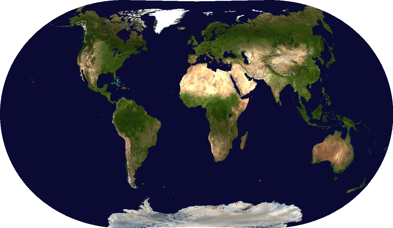
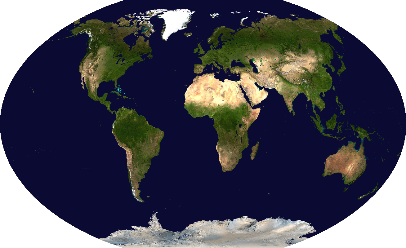
Balanced areal and angular distortions
Here I assigned a weight of  area loss and
  to
angular loss, resulting in a good compromise map that minimizes both.
Dare I call it... Martin 1?
to
angular loss, resulting in a good compromise map that minimizes both.
Dare I call it... Martin 1?
I plotted where areal and angular distortions are greatest.
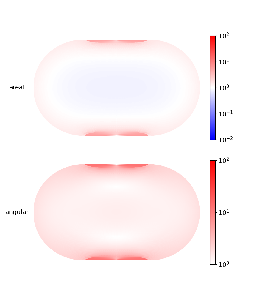
Here you can see that areas are slightly shrunken near the center of the projection and inflated near the edges, especially the poles. Angles are also most distorted near the poles.
You might wonder why the poles are most distorted, even though I'm applying the loss function uniformly over the globe. It's due to our choice of interruptions. We've cut the globe around the antimeridian, and this cut starts and ends at the poles, which makes them the hardest places to project accurately.
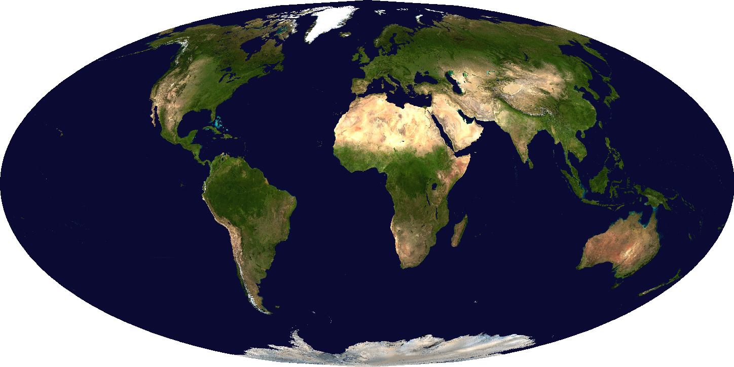
Comparisons
Let's compare this with a good traditional map projection, Winkel Tripel:
Winkel Tripel
I think Martin 1 looks substantially better in the corners, such as Alaska and New Zealand. Winkel Tripel isn't terrible, but it does screw up the angles in these regions. And most obviously, Antarctica looks somewhat rounded and 3D in Martin 1 (as it should), whereas Winkel Tripel makes it appear flat and stretched.
Let's compare the area and angular distortion for these two:
Martin 1Winkel Tripel
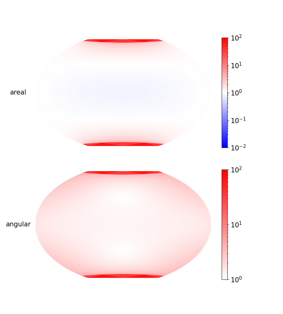
Even though Martin 1 distorts the poles the most, it does infinitely better than most traditional projections, which distort the poles... infinitely.
The spectrum: equal area to conformal
By adjusting the loss function, I trained an optimal map for each weighting
 of areal vs. angular loss.
I'd love to compare loss for trained vs. traditional projections on the whole globe, but unfortunately most traditional projections have infinite losses at the poles. The only one I compared against with finite loss everywhere is Mollweide, since it faithfully represents each pole as a single point. Kudos to you, Mollweide:
So instead I compared loss for trained vs. traditional projections
between  latitude:

This is overly generous to the traditional projections, since it leaves out the hardest part of the globe, but my projections still have lower loss.
One cool detail: I used JAX to compute the exact Jacobians of each traditional projection at all lattice points on the globe. Traditional projections mostly have differentiable formulae, so this is more precise than using the projected xy-coordinates to estimate the local deformation. But machine learning frameworks are mainly focused on taking gradients (of a scalar with respect to a vector) rather than Jacobians. Fortunately JAX is a bit more of a general autodifferentiation framework, so it had support for taking batches of Jacobians. When I made the decision to use it in early 2023, it was the only framework able to do this (as far as I could tell). By now it's possible Pytorch can do this too? Haven't tried.
The above scatter plot shows the spectrum with ![\alpha \in [0.03, 0.97]](/latex/29f4d30bd03708f013ff56f483ec9258.svg) , but
I actually trained map projections for the range
, but
I actually trained map projections for the range ![\alpha \in [0.001, 0.999]](/latex/e94998448f6a98124e0138066e3ddf96.svg) and made them into a video, transitioning from nearly-conformal to
nearly-equal-area:
and made them into a video, transitioning from nearly-conformal to
nearly-equal-area:
Every landmass is fascinating, but Antarctica is particularly distinctive here: as we go from conformal to equal-area, it gradually gets cracked open until flat.
Next time, I'll toy around with the loss functions in the ocean (and maybe some other things).
Map Projections 4: Bullying the Oceans
Map Projections 5: More Interruptions